Fleece Buffalo Jacket/coat!
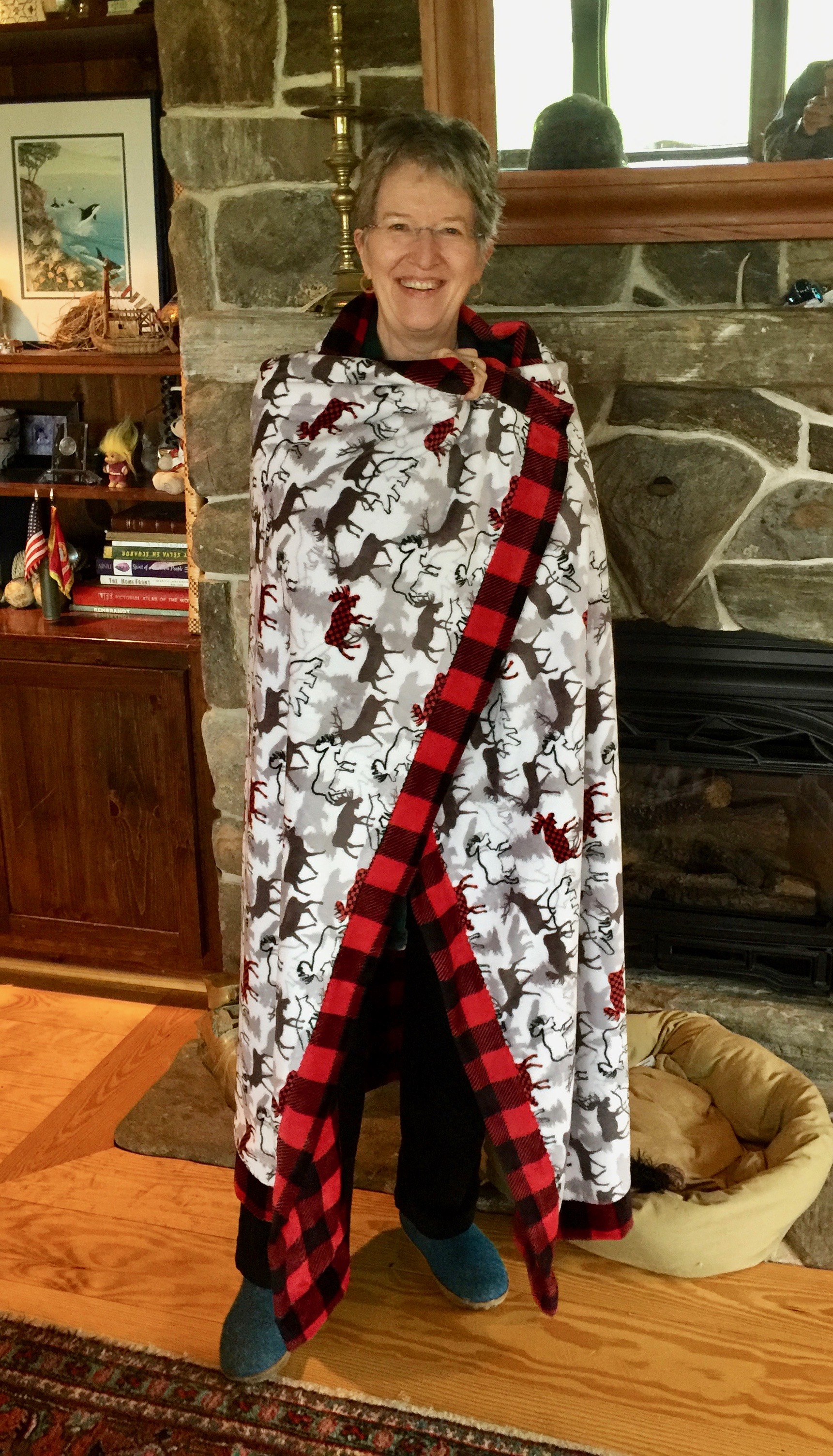
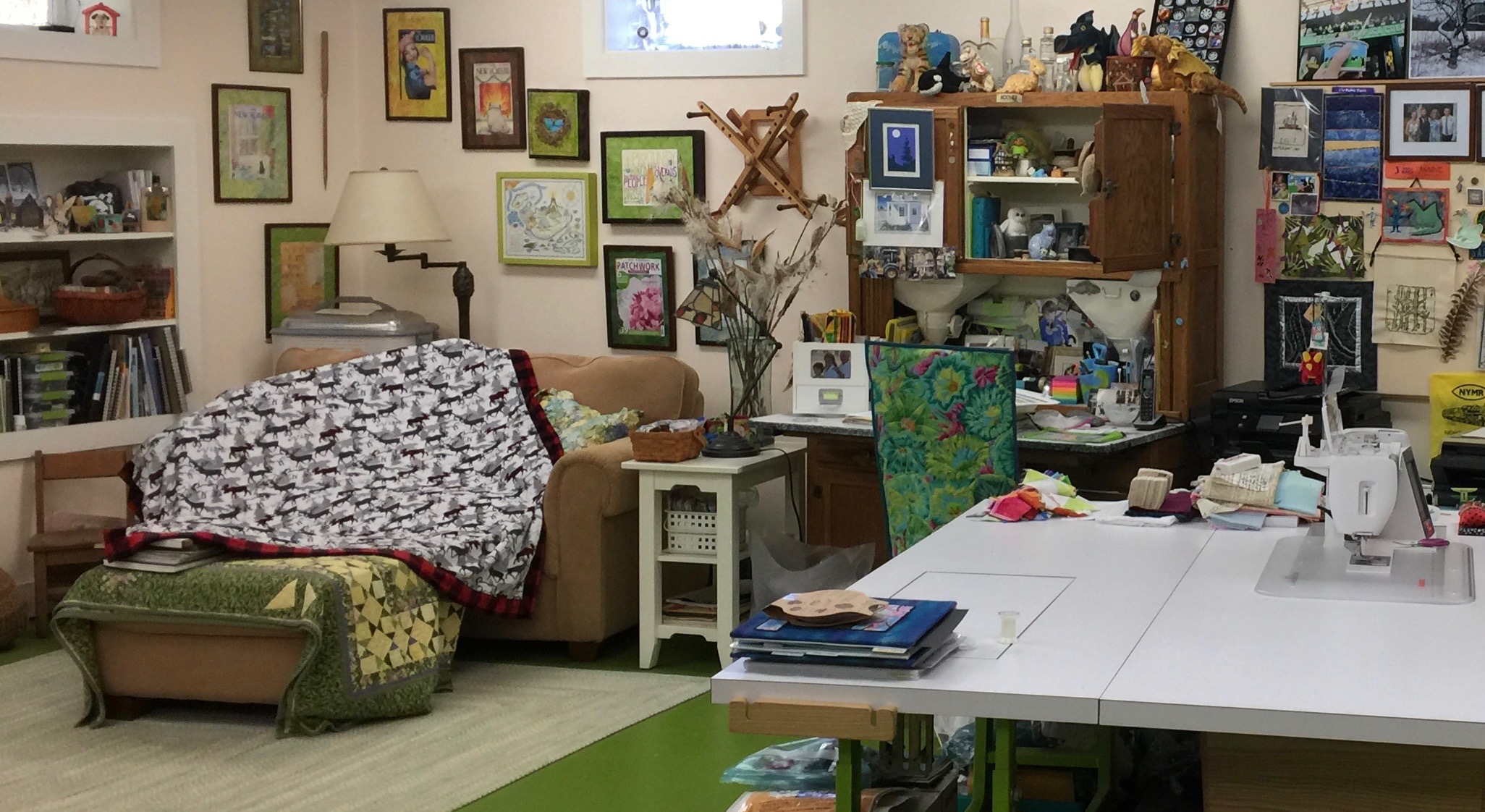
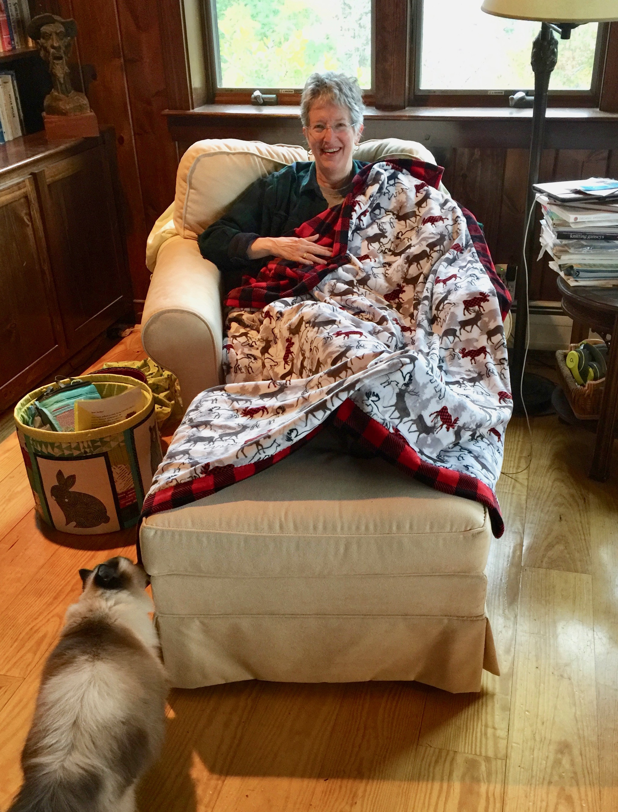
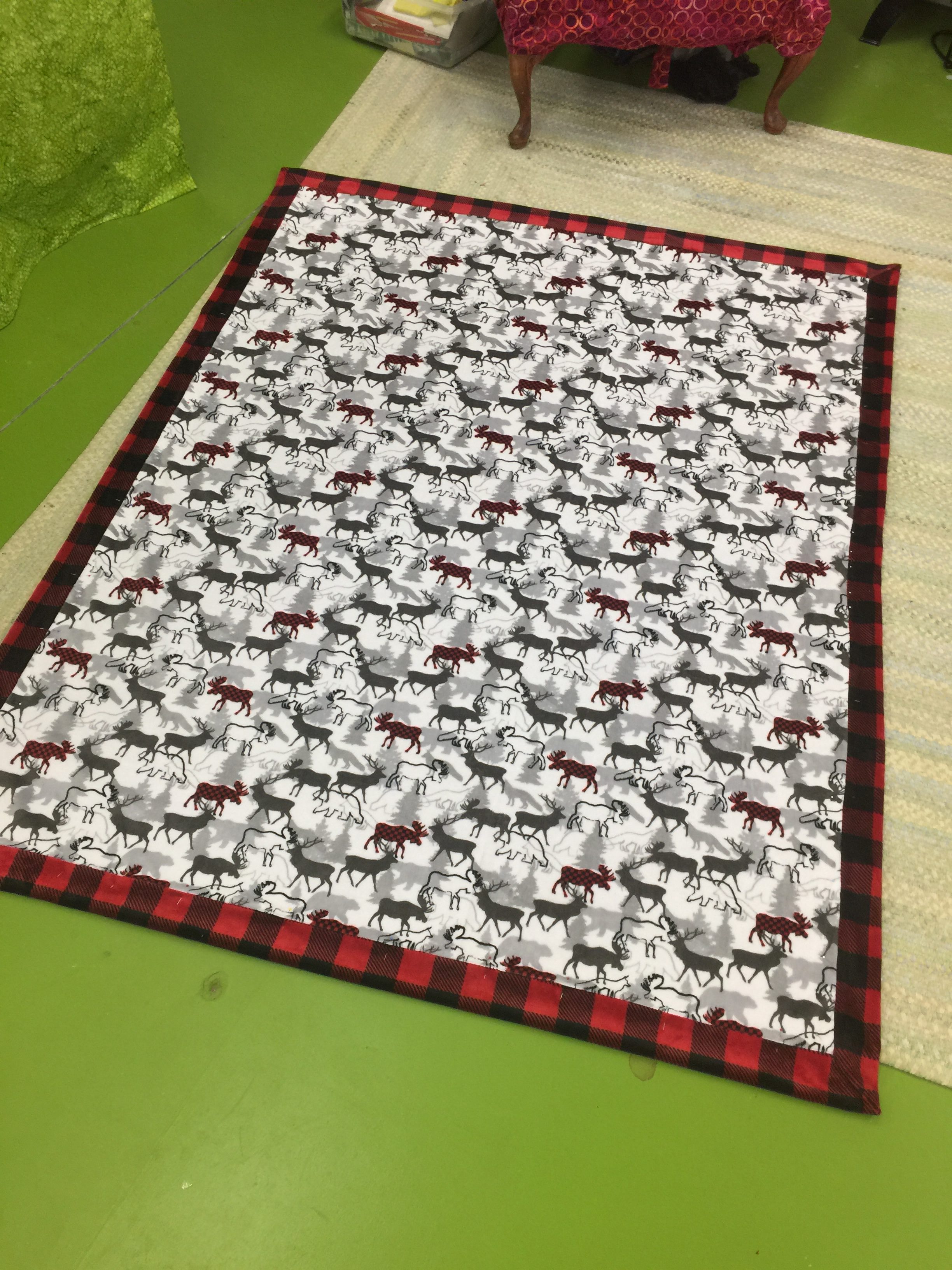
Tuesday, October 30th, 2018Hi everyone…preparations for teaching at International Quilt Festival Houston are nearly done, so I can return to somewhat regularly sporadic blogging! In addition to that snuggly lap robe/blanket in Cuddle fabric, I also recently made a hooded jacket using two layers of fleece and a Simplicity pattern.
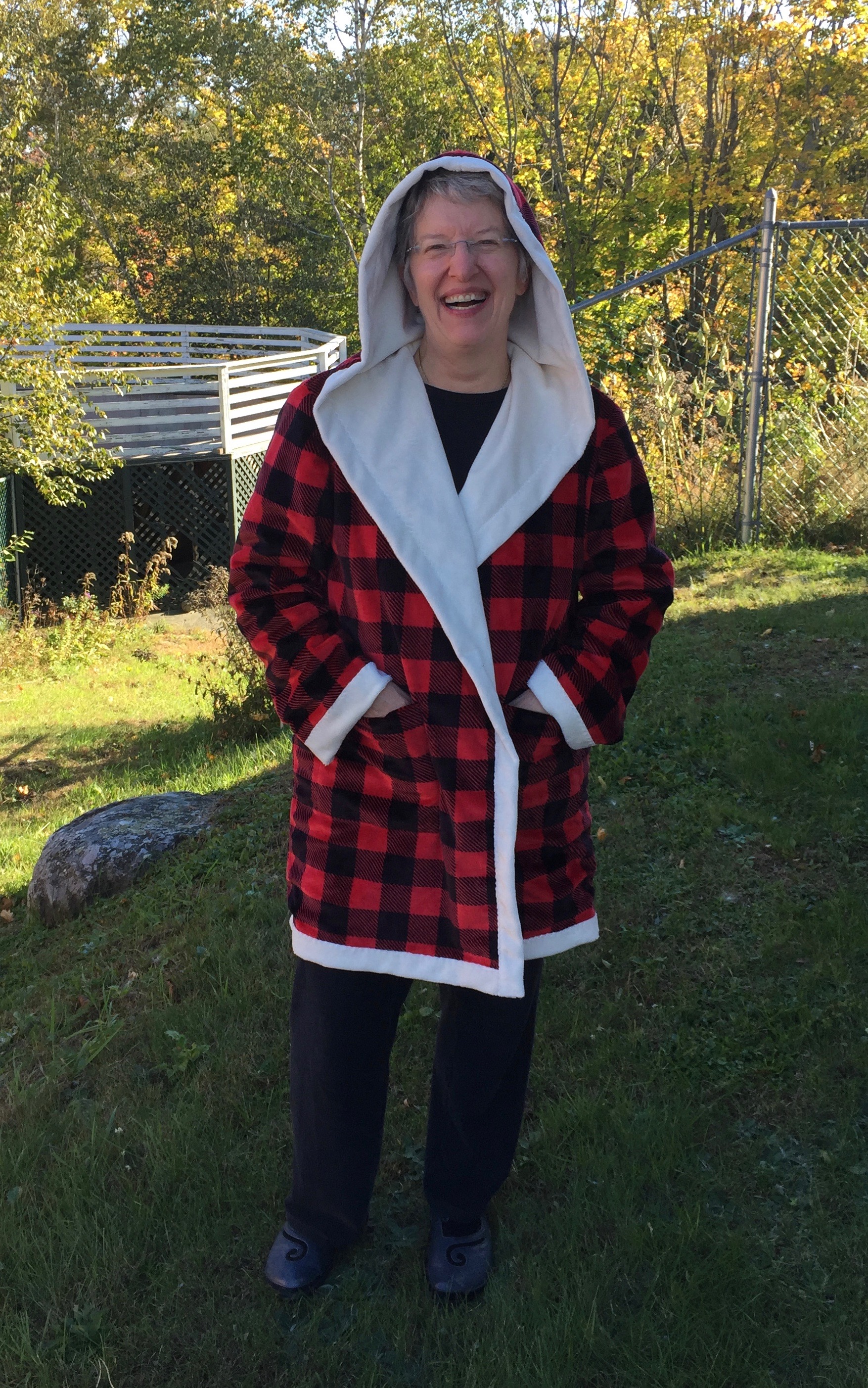
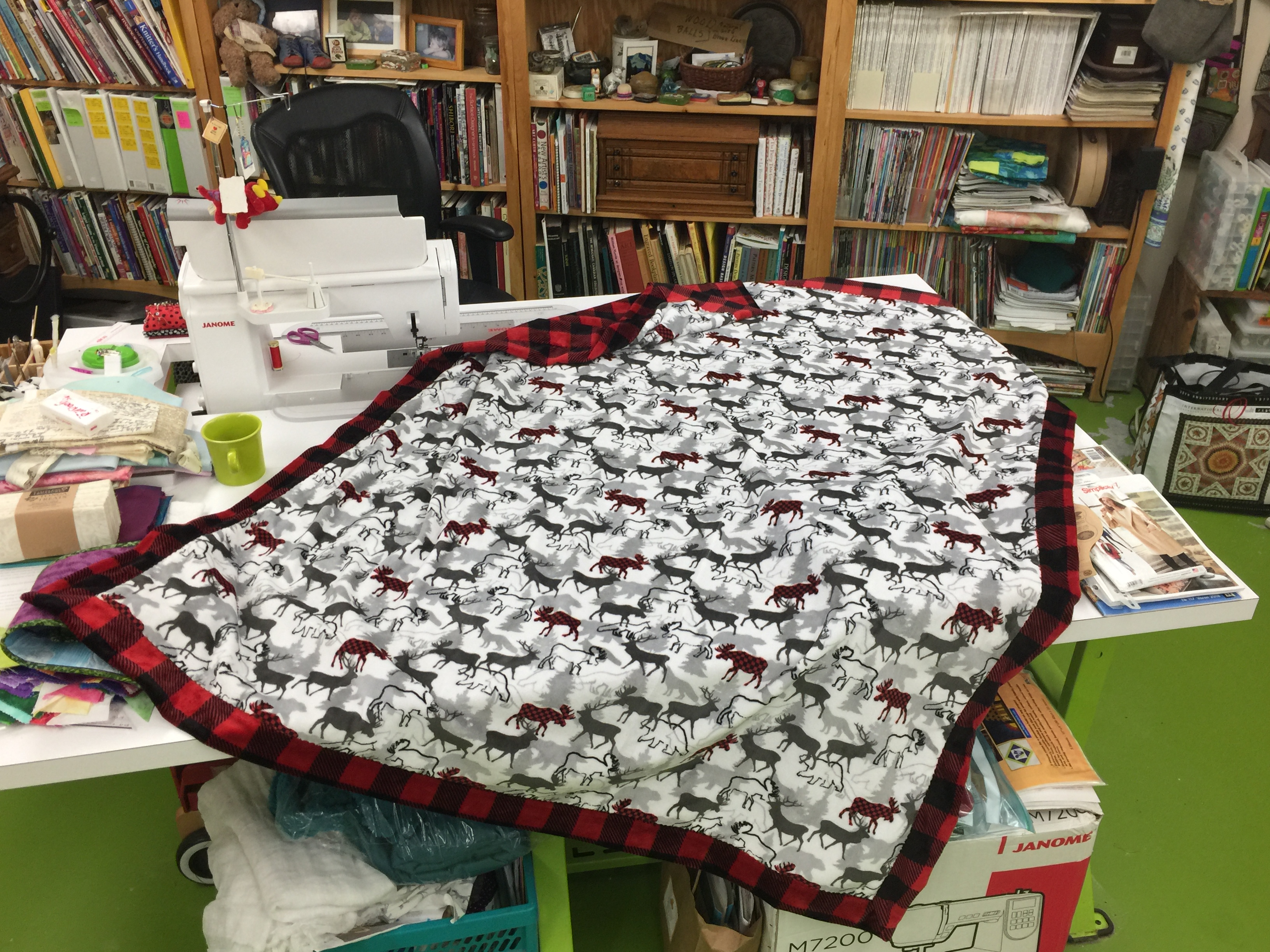
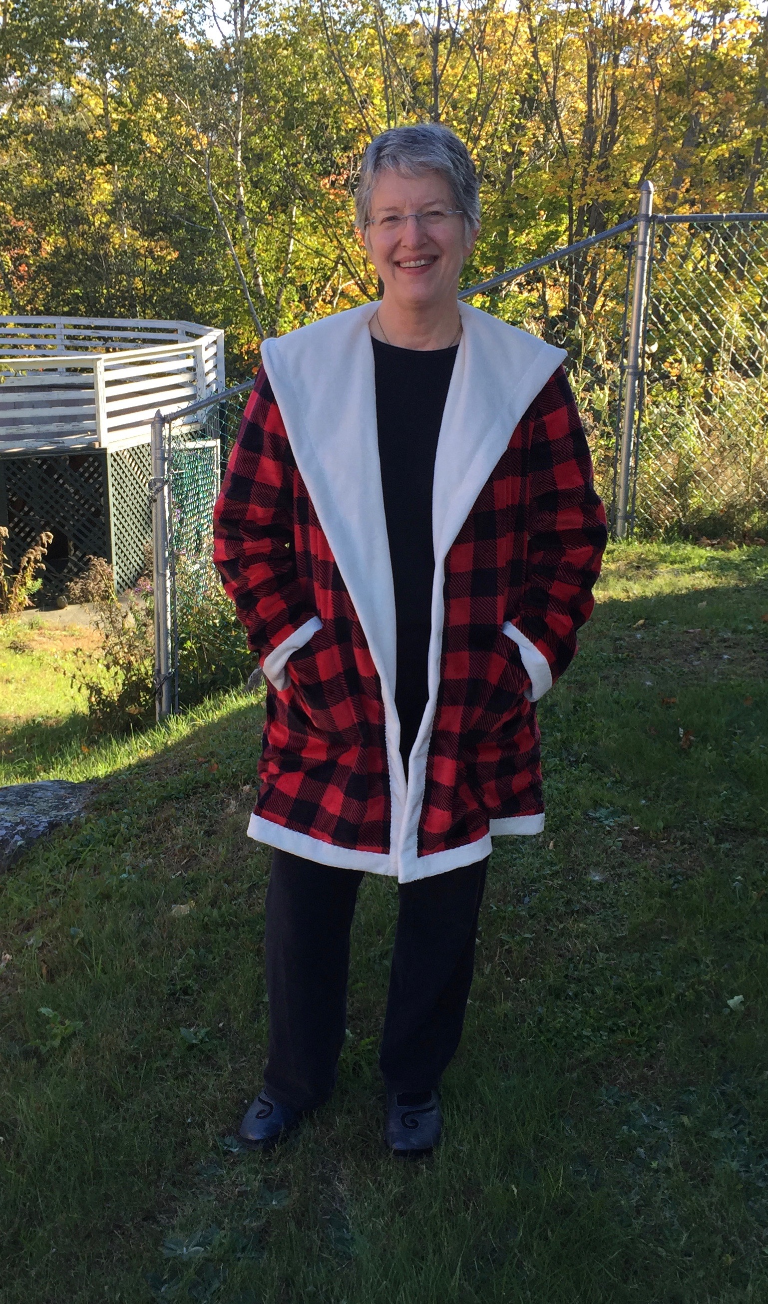
Cuddle-y two-layer fleece jacket–I may not want to take this off this winter!
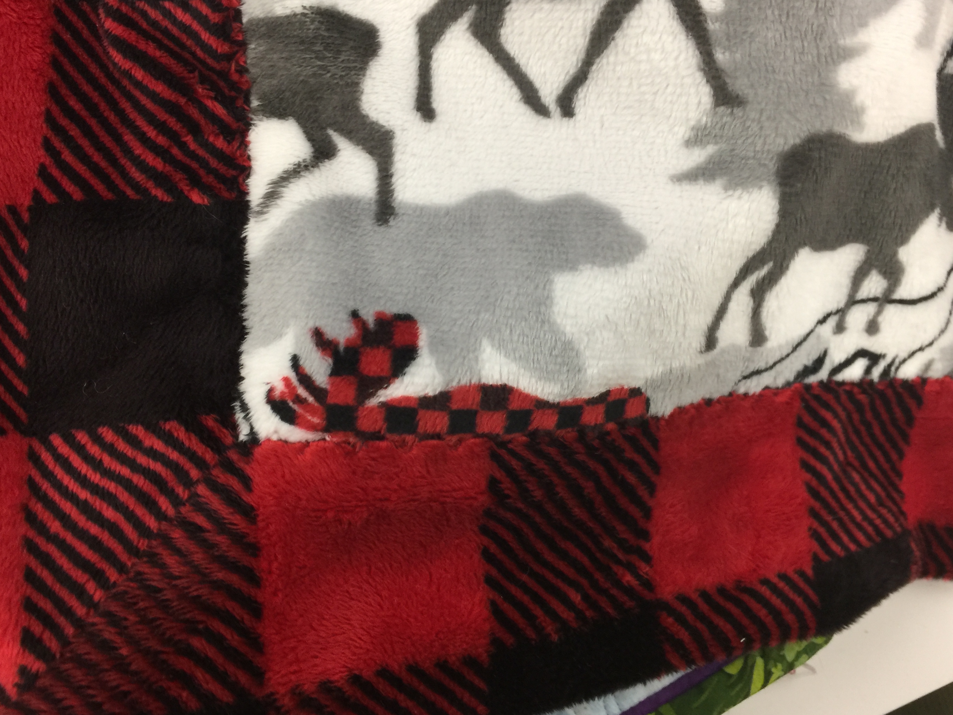
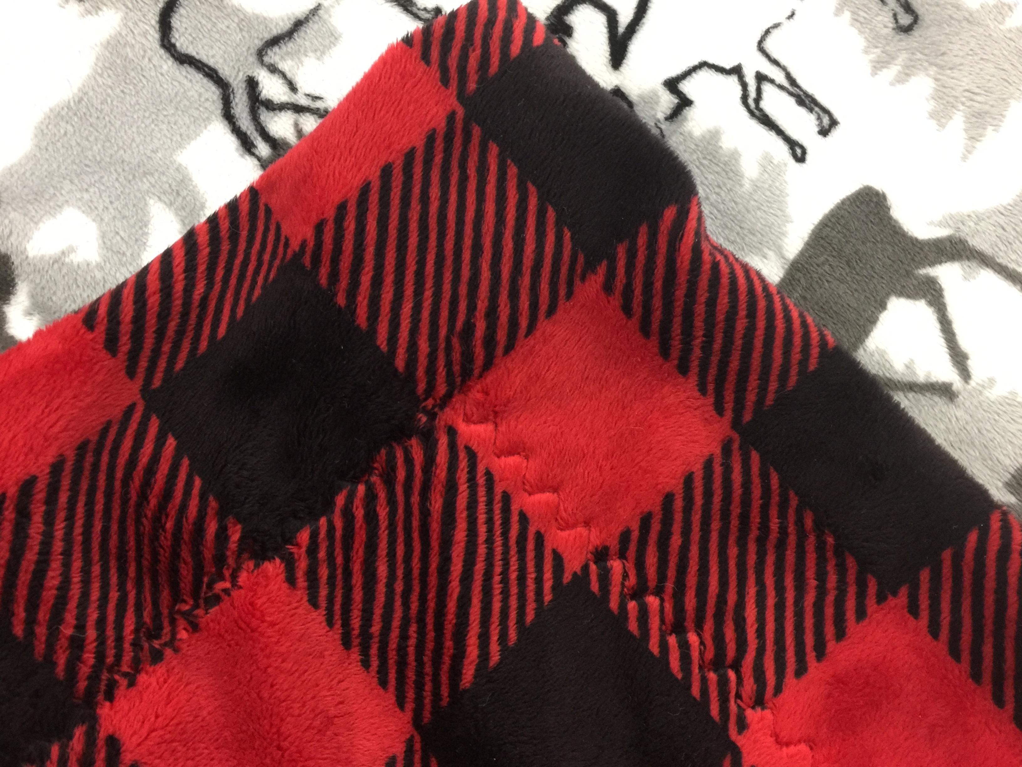
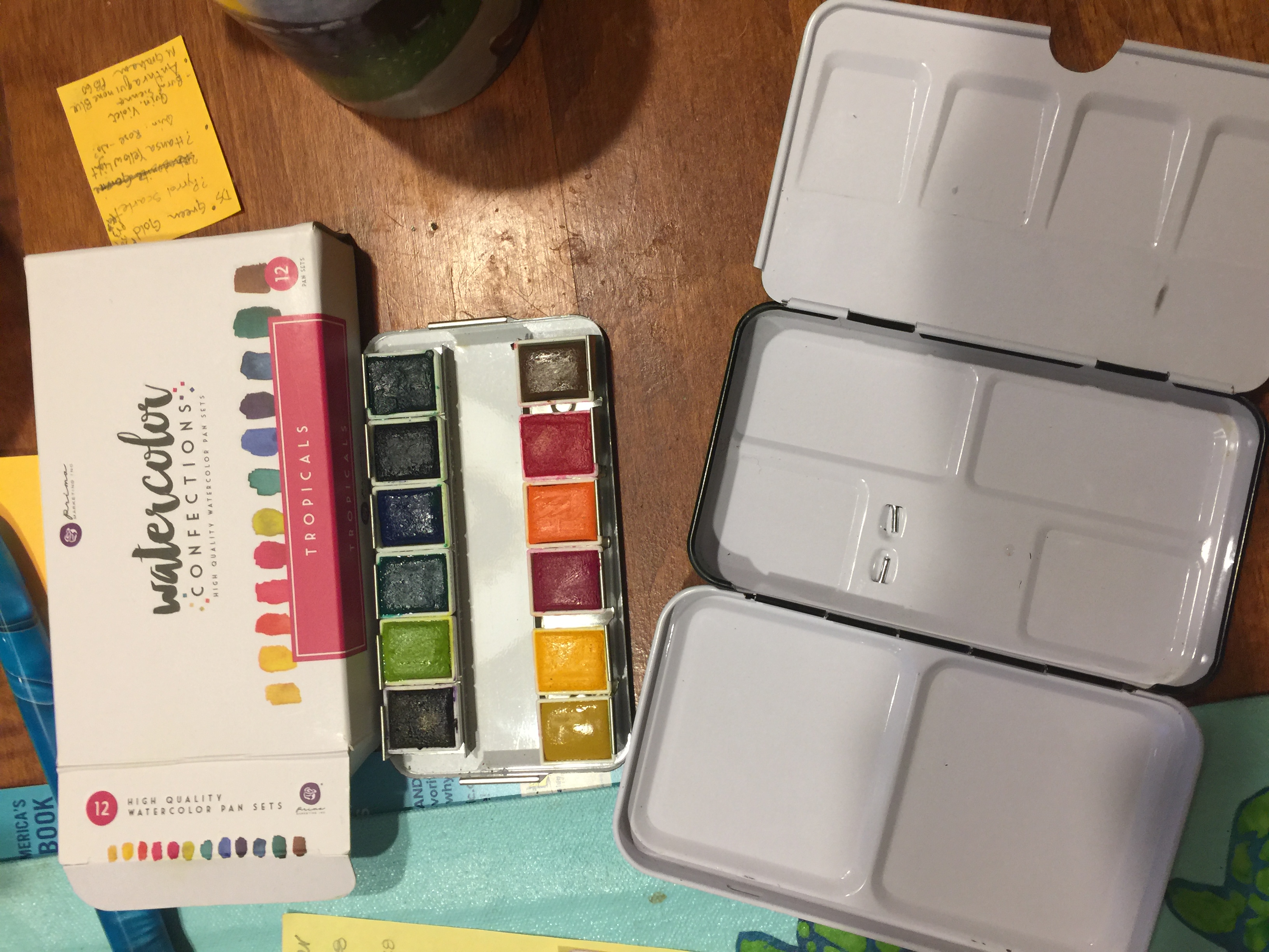
As I’ve; mentioned in earlier posts, I totally fell in love with Shannon Cuddle fabric at the Janome Education Summit this past May. Here’s a link to the buffalo check (temporarily out of stock as of October 30) Shannon scarlet and black Cuddle.
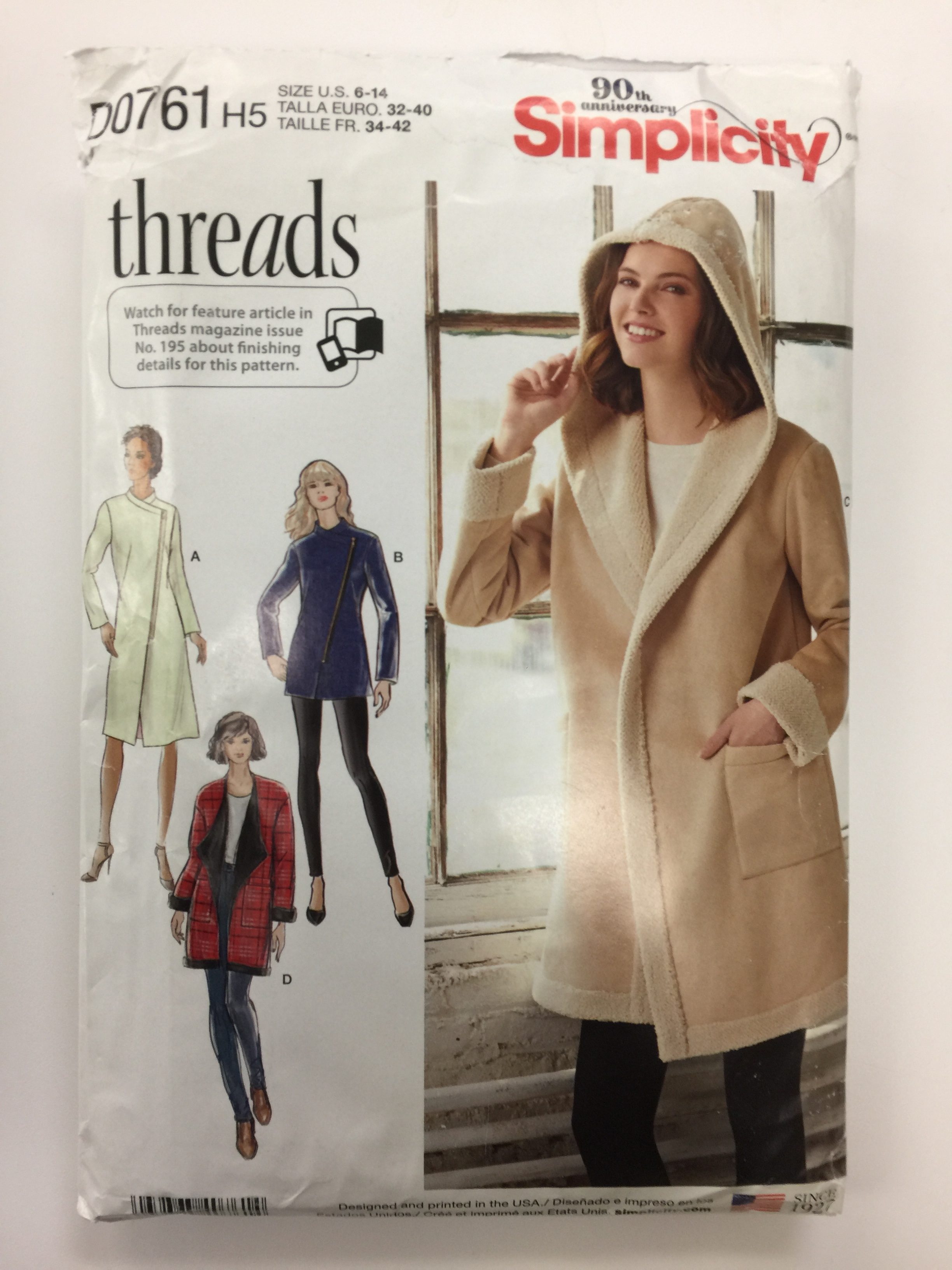
Here’s the pattern I used, Simplicity D0761. I purchased 2 3/4 yards of both the ivory cuddle and the buffalo check. I would recommend an extra quarter yard of the check if you plan to match the plaid as I did at sides and sleeves. The pattern is cool because the hood is cut with the fronts as one big piece. The only fiddly part in the entire thing was the shoulder-back neck-shoulder seam, and even that worked a charm with careful pinning. A confident beginner could probably tackle this.
The pattern is designed for a two-sided fleece such as the sherpa/suede. Instead, I made two jackets. I cut the outer jacket perhaps 1/8″ larger than the pattern and sewed it with a 1/2″ seam allowance, not the standard 5/8″. I sewed the ivory inner jacket at accurate size and with a generous 5/8″ seam allowance. This allowed the fluffy Cuddle to fit inside. HOWEVER, the back side of the Cuddle is slippery. If I were to make this again, I think I would cut my fabric pieces slightly oversized, sew them together as if quilting (wrong sides together) along the black stripe, THEN trim to final size and sew it as if it were ONE fabric. Currently, even though I tacked the coat at the neckline, it has a propensity to wiggle and sometimes bubble at the hem.
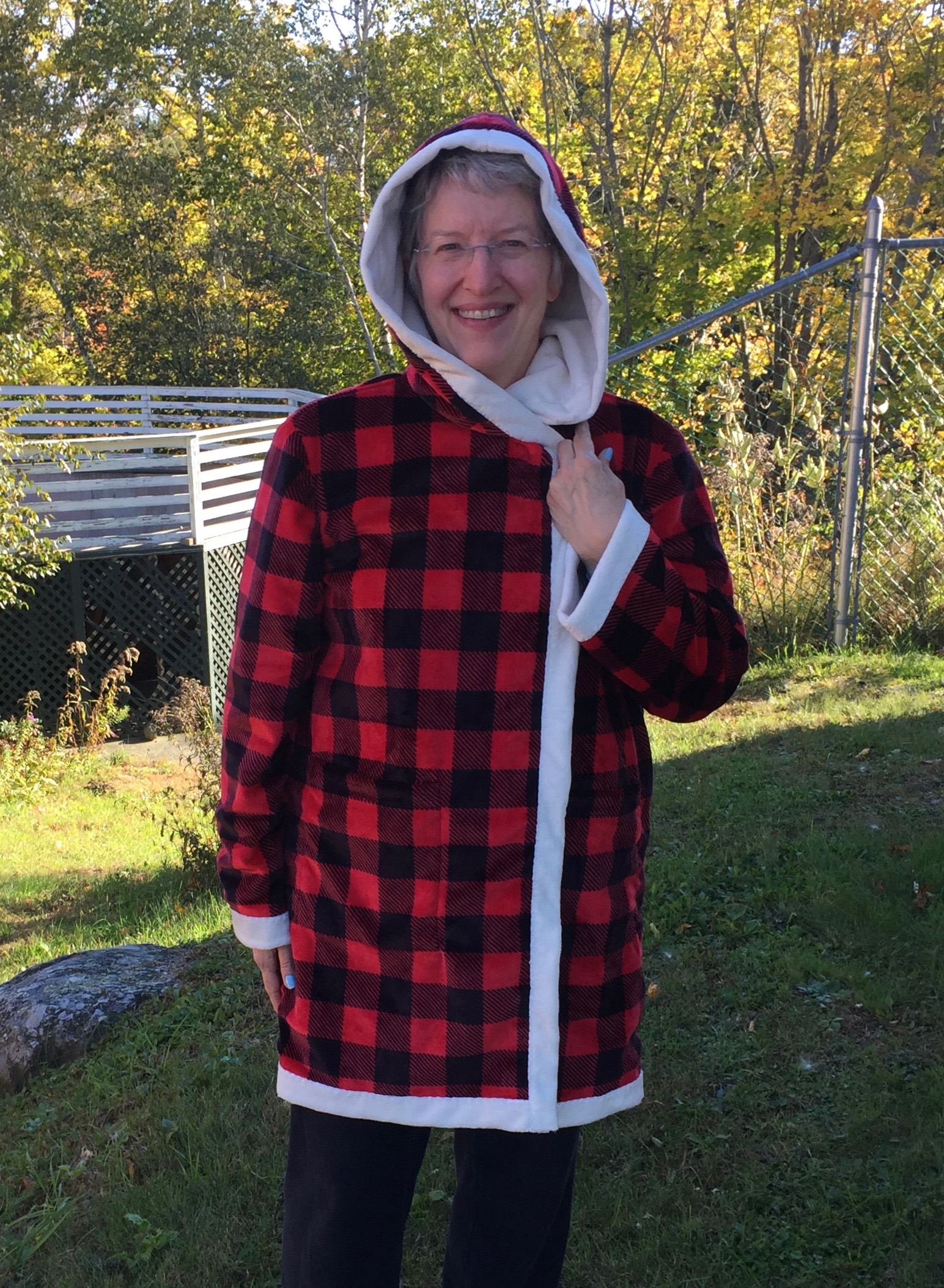
Hood down and open.
The pattern doesn’t have a closure, but I have some black toggles on faux-leather and may use one.
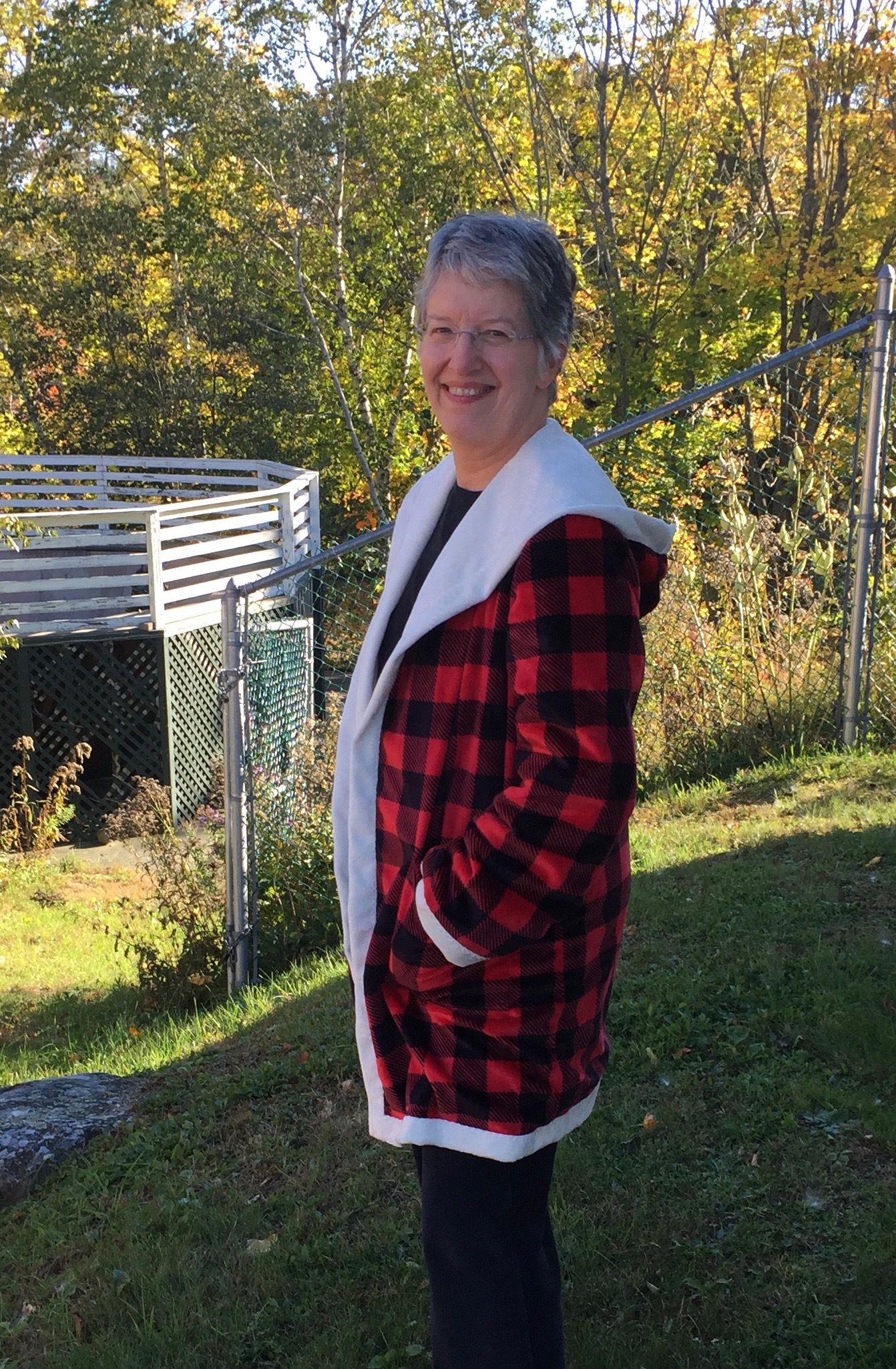
And a side view showing the hood.
Thanks as always to Janome America…sewing this on my Janome 9400 was a DREAM. I used the acufeed foot for pretty much everything and the serpentine or lightning stitches. I used the lightning (a type of zigzag) for seams at 10 width and 3.0 length, which accommodates any stretching. I used the serpentine on all the turned-over white bits. Since the Cuddle does NOT RAVEL at ALL, you don’t need to turn under the edges so the serpentine was perfect and it hides in the pile of the fabric.
I’ll repeat the tip I gave before on the blanket: minky type fabrics are known for shedding fluff. To minimize the mess, cut from the back side (with a scalpel type cutter if you have one–I don’t so I just used scissors; I also cut from the front to stay on the lines!). Carefully put everything including the scraps into a plastic bag, carry it to your dryer, and set it on air dry for maybe 5 minutes. The fluff ends up in the lint filter, so remember to empty it out and perhaps use a damp cloth to wipe out any stray bits. This reduces the shedding by about 90 percent!