email Youtube

Home
Galleries
Blog
Workshops & Calendar
Store
Resources
About
Contact

Author Archive

Joshua, the quilt in progress, #2

Wednesday, April 14th, 2010

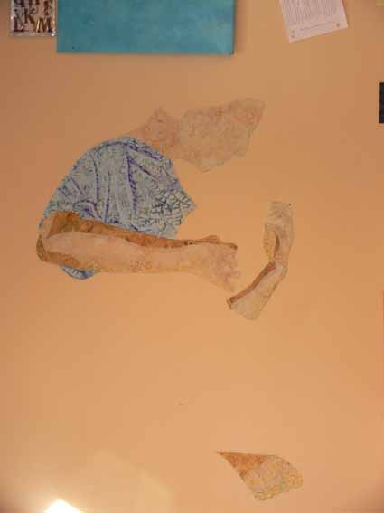
So last post on this topic, I said I’d share how I began the quilt itself:  the hardest part first.  That, of course, would be Joshua!  The face, head, hands, then body.  When I first thought about this quilt, I had thought I would do something like I did with the quilt of our pug, Pigwidgeon, and it would be in totally NOT realistic colors.  If I wanted to stick to light values for the skin tones, that meant I had the following not-realistic options:  pale pink (nope), pale yellow (nope, sallow), pale green (the Green Giant?), pale blue (nope, sickly), pale purple (BLEAH! NO!).  So I revised my plans and decided to use real skin tones and tweak all the other colors.

I found a batik that was pale beige and golden scrolls, and decided that would be my base for his face and neck, selecting a darker part of the fabric for his neck.  I underlined it (fused it to) a solid white to prevent the dark walls (which would go behind his head) from shadowing through on the “seam” allowance.  By the way… I should add that this entire quilt top is fused applique, using my favorite fusible,  MistyFuse.  Even when you have multiple build up layers, like his hair, it stays supple and fabric-like…unlike some brands the feel and sound more like cardboard once you get two layers or more!

For his arms, I used five values of cream to dark tan for the shadowy side of his arms.  The rest of the shading was done with thread.  Note the bottom of his foot, down low on the wall.  For the clothing, I used three values:  I picked the main fabric for the t-shirt, then found a lighter blue and a darker one for the highlights and shadows of the folds.

Next, the hair!

Not that there was any doubt….

Monday, April 12th, 2010

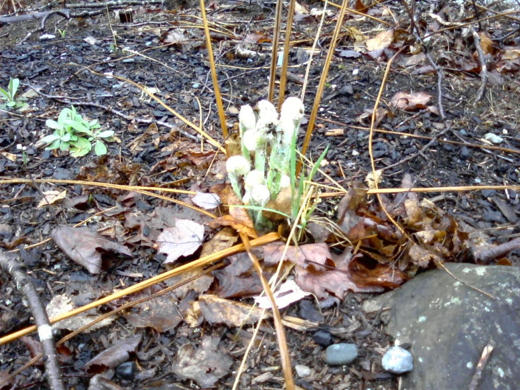
But spring is truly here.  Proof?   Go on a dog-walkies midday and spot the FIRST FIDDLEHEAD of the season!

Joshua, the quilt in progress, #1

Saturday, April 10th, 2010

A short while ago, I was able to share the finished results of my most recent “big” (36 x 48 inches) quilt, a portrait of my son Joshua.  I love seeing quilts come to life, and watch the creation process when other folks make things, so I thought I’d share how this one came together.

First, several months before I finally got to cut fabric, I took photos of Joshua playing guitar (after asking nicely for a few weeks, I finally pinned him down one evening).  Sitting on the floor to get a not-the-usual angle, I took about 60 or 70 snapshots, many of which I was able to rule out immediately (mostly due to closed eyes, mouth hanging open, blurry fingers).  I narrowed it down to three:  one for the position of his head (mouth closed, eyes open–on the right, below), another for the position of his hands and body (on the left), and a third for some extra details on the room.

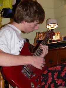
Then, I fiddled around in Photoshop to come up with a line drawing.
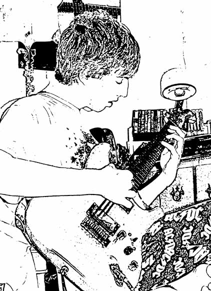
I sized this so that it would fit four times on a piece of paper and did what is called a value study.  I learned about this from an online educational resource (pay to play–thanks Deirdre for sharing this one with me!), www.artworkshops.tv , an online tv/classroom site.  I watched the video by Polly Hammett on Design with the Figure.  One of the things she showed was doing quick thumbnails (quickie outlines) of her intended composition, then using ONLY black and white, blocking out what would be light and what would be dark.  By using only black and white, you get immediate, stark visuals on the shapes and negative spaces (the shapes between), which gives you an idea how the composition will work.

This exercise was INVALUABLE!   Since I never went to art school (last class was my one and only year in art in high school), I’d never heard of this, though it is probably a basic! Here is a snapshot of the value sketches I did, except I “cheated” took a shortcut by using the Photoshop Elements outline.  The two on the far right are the “blanks.”  The one I ended up using is the bottom row, third over:  Joshua’s face and arms are light, the background is deep dark, the guitar medium in value (again, I fudged a bit on the black-white only and expanded it to include a gray).  PS–this one photo is clickable for a larger view:
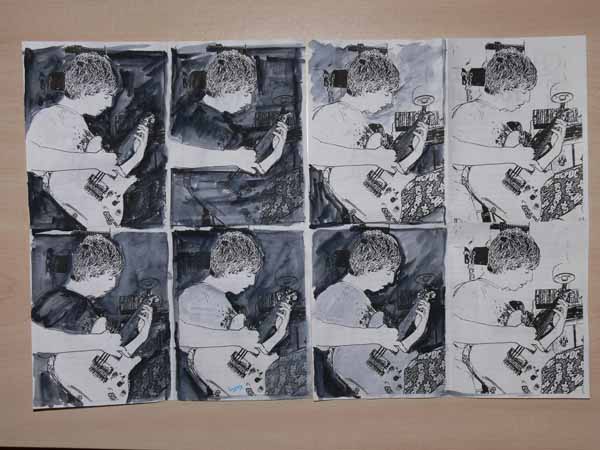
This helped me decide on my colors.  I knew that I wanted Joshua to be the focal point, with his guitar as the secondary focal point.  That meant if Joshua’s skin was to be light, the wall needed to be dark, not the celery green it really is.  If you look again at the value studies, you can see how much more his face pops when it is against something super dark, not just “gray” or medium value.  I also darkened up the dresser, bedding, and eliminated details (posters, books on dresser, clutter!) to make my life easier and to make the composition more focused.

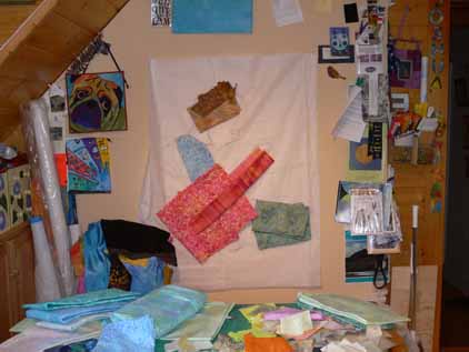
Next, I used my laptop, hooked up to my digital projector, to project the main photo onto the design wall, where I had taped up paper (medical exam table paper, long, cheap, taped together–bought a roll from my doctor for $5 and it is 3+ years old and still plenty left) and traced out the outlines.  Here’s a photo of the drawing on the design wall with preliminary fabric ideas pinned to it:
Next, I’ll show how and where I chose to begin…the hardest part first!

PS:  Norma asked what process I used in Photoshop Elements.  I’ve tried to duplicate it and I THINK this is what I did:

I think I converted it to grayscale first; Go to Image, then Mode, then click on Grayscale.

Then,  under Filters/Sketch/Stamp, click on stamp and adjust the light/dark slider to about 2… I think.

I just tried to re-do this, and that is as close as I can get.  Shoulda taken notes!

Peeps in the ‘hood

Wednesday, April 7th, 2010

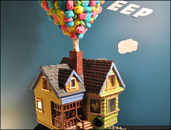
Who says Washington, DC and the rest of the National Capitol Area don’t have a sense of whimsy?

Yes, it is that time of year again, the Peeps contest at the Washington Post!  This is as fun as the “alternative definitions” contest that comes in the doldrums of summer.   If you want to fritter a bit of time away enjoying creativity with peeps (those sticky marshmallowy Easter candies shaped like peeps (baby chicks), bunnies and whatnot), visit here:

Washington Post slide show of 2010 Peeps Show

and for the related article, click here.

Now…back to prepping for next week’s teaching trip…more quilty stuff soon…I hope!

Storm runoff

Monday, April 5th, 2010

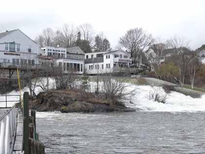
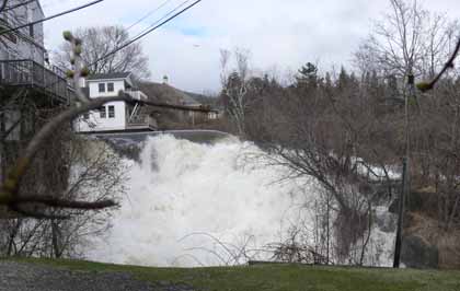
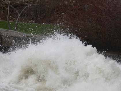
Those of you who live in the US probably heard about the torrential rains in the Northeast last weekend (and how different from the glorious, summery day yesterday!)–Rhode Island had serious flooding.  It wasn’t as dire up here, but we sure had some serious rushing water!  That meant everyone in love with their camera, including me, was out taking pictures.  Here is where the (relatively small) Megunticook River was roaring down the falls into Camden Harbor:

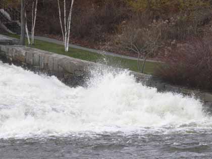
I was so pleased at my camera’s ability to capture the drops of spray:

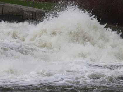
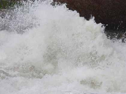
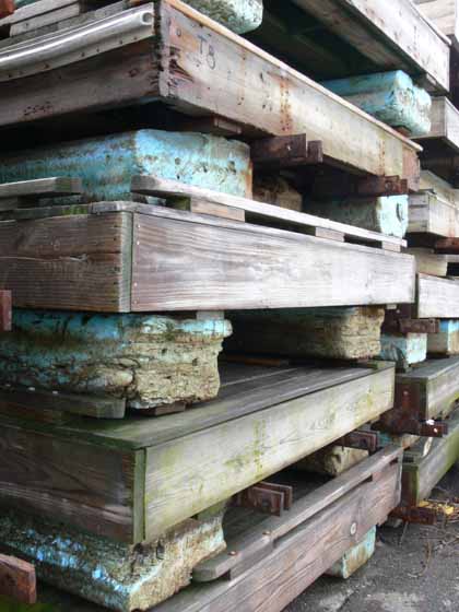
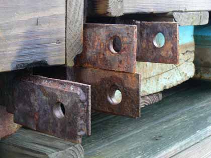
The docks are still out of the water from winter, so snapped a few abstracts, too:

And then upriver, by the old mill complex….  After the woolen industry tanked up here in Maine, there were abandoned mill buildings across the state.  Some have been converted into artists studios, commercials spaces, and business depending on the town.  The credit card conglomerate MBNA (which got gobbled up by Bank of America a number of years ago) was actually based here in Camden, and they did a beautiful renovation of the buildings, including adding this footbridge from one building to another over a small falls on the way into downtown.  The bridge I stood on (for cars) is on Knowlton Street, just down from the middle school:

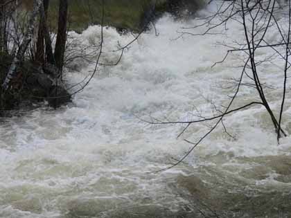
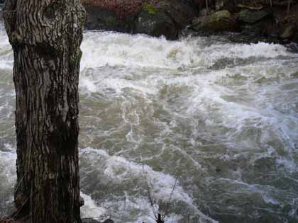
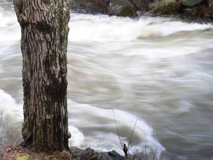
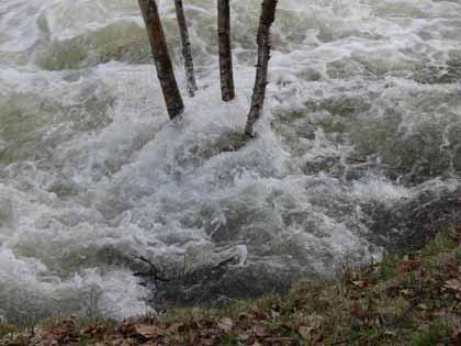
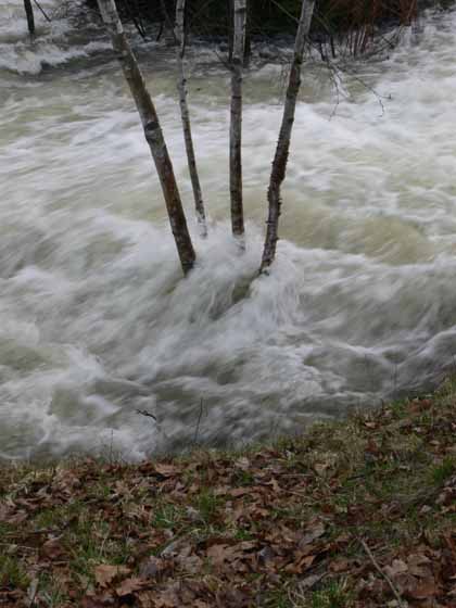
I tried and for the first time on digital (as opposed to film) camera, was able to capture the feel of rushing water.

The ones where you can see every detail were shot at either 1/500 or 1/1000 of a second shutter speed.  The ones where the trees are in focus but the water is racing past were shot at either 1/40 or 1/20 of a second (camera propped on railing in lieu of a tripod).  I love seeing the difference and feeling the speed of the river: