email Youtube

Home
Galleries
Blog
Workshops & Calendar
Store
Resources
About
Contact

Author Archive

Coming Home, another moment of beauty

Sunday, August 28th, 2011

Time to get caught up on what all I’ve been doing the past month… first, I came home!

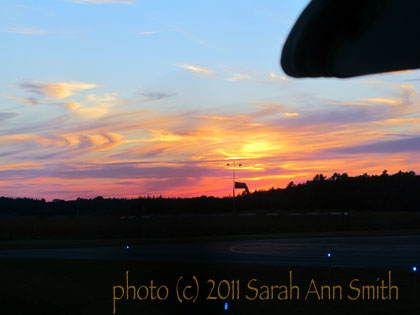
Flying in to mid-coast Maine at sunset....sigh....those rays of sun I call angel escalators. When I was 4, we returned to the US from living in Argentina. I had never seen escalators before and was entranced! I was also bundled off to Sunday School where they wanted us to NAP (not!). I wondered how the angels got from heaven to earth, and decided that sunbeams must really be angel escalators, so that's what they've been ever since, and now my kids know about them, too.

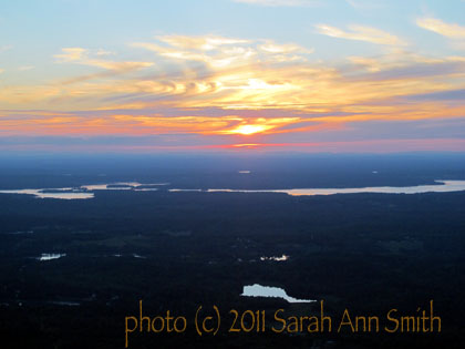
The best part of coming home to Maine is, of course, the people and the critters starting with my husband, sons, pug and cats!  But coming home to Maine is pretty amazing.   I flew in from teaching at Quilt Nebraska on July 31 to this…how can anyone NOT want to live and be here?

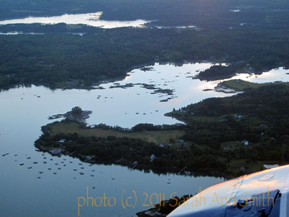
I love these aerial shots, this one taken over the wing of the prop Cape Air plane (about 9 seats I think). This is the peninsula just south of Owl's Head which is just south of Rockland. The airport designation is RKD, but it is really in Owl's Head and is 35 minutes from home.

Then the sun began to set…OH MY!

Just LOOK at those colors!

And the clouds…oh my oh my…

And a different view....love those curling up wisps and that one dark cloud hovering over the sun


And more...

As we were landing...


And a close-up

The color got really intense and dark when I zoomed in on the sun.


And touchdown…

And on the ground...see the windsock in the distance... I think the blob in the upper right is part of the plane/tail.


Sketchbook and watercolors on location

Wednesday, August 24th, 2011

Hi all… I am beginning to resurface and return to being me…what a concept!   After the tumult and demands of the past four years,  it appears I was up for a change of pace.  I NEVER do stuff spontaneously…just too much to do, too many obligations.  Then I saw Jane LaFazio‘s Facebook post about her new Joggles class, Sketchbook and Watercolor:  On Location, two days before it was to begin.  So I signed up, that day! Fortunately, I had most of the supplies on hand.   In something that hasn’t happened in about two (or more) decades, I am actually doing a class, doing the homework/assignment the week it is assigned!

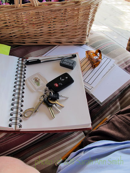
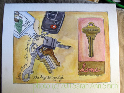
Our first “location” was an easy one:  home!   We were to sketch keys, journal style…. I missed that part.  The Journal, not a whole shebang thing.  I was so excited I took plenty of time and really worked at it, and am thrilled.  My ability to draw is still tentative, but I worked at it enough to get it!

In utter decadence, I sat on the front porch, taking my art supplies with me in a basket. I used a journal sketchbook as a plain background to better see the keys.

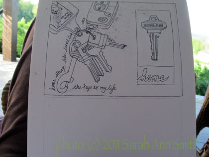
Next, I sketched, taking my time:

Here, I have sketched the exercise in pencil, inked over it, and begun erasing the pencil marks. My 5x7 "block" of watercolor paper hadn't arrived yet so I used some student-grade watercolor paper I had in a pad in the studio.

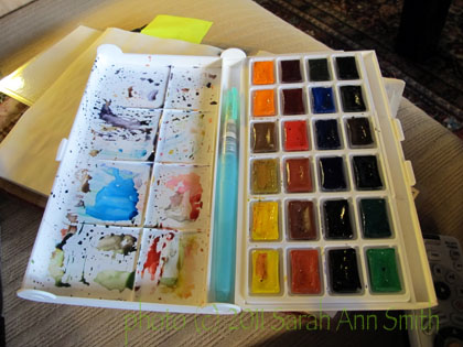
Then it was time…GULP… to start with the watercolors.  I have two travel sets…one larger, one smaller.  I used the larger one since I was at home:

This set is "Yarka St Petersburg" which I must have ordered from Dick Blick. They seem to have a high pigment load...must have been a good price. And the blue thing is a Niji waterbrush...LOVE them!

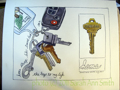
So I started coloring in…what a different using watercolor paper makes!  It doesn’t bleed!  You get edges you can control!!!!!!

Not bad... this might have been a good place to stop as a "journal" exercise.....

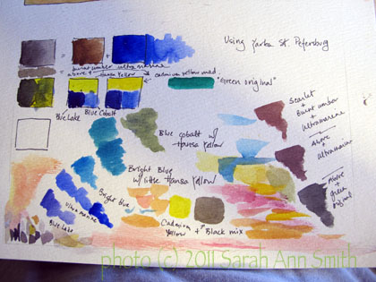
But I kept going.   Learning how the colors would look on the paper was, well, a learning exercise!  I used the bottom of the page to test color:

Mucking about with the colors to see what combinations would make the color I wanted. I need to do more of this.

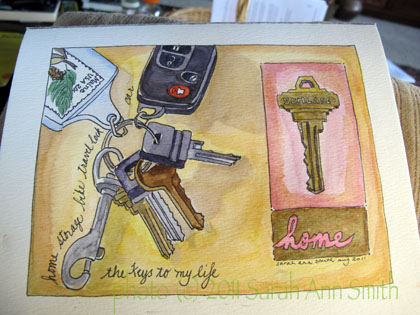
Not quite done…. colors need tweaking in this next photo:

I thought originally that I wanted to use my favorite Caribbean bright and clear colors. Wasn't working for me. So I went over the backround to blend in the shadows, and over the pink wihich was too little-girl bright. If you look at the key on the right, you can see the original pink next to the key and the washed-over / toned-down on the outside.

Finally, done, and I’m happy:

Done!

So far I am loving the class.  Lots of good participation by the students which makes the class even better.  Also, I really like Jane’s replies.  She comments on each and every effort posted.  And she doesn’t shy away (as some teachers do) from making suggestions or commenting when things are off.  Her replies are always kind and courteous, but you learn so much MORE when the teacher will point out what is amiss and how to fix it.  She also shared this blogpage where she lists *her* favorite supplies.  Most helpful!  Anyway, I’m having a BALL!  What an utter job to be able to relax, learn, muddle around with art, and take some time for myself.  I am sincerely hoping that the stress and tumult of the past four years are over, and I can return to something resembling normalcy.   I said in a post to the class that I feel like I’ve been in a years-long drought and have just found a spring of water and nourishment.

D Minor Harmonized

Saturday, August 20th, 2011

So much has been going on that I’ve been really busy, have a ton of things to share with all of you, stuff quilty, home-y, but sometimes a mom’s just gotta brag on her kids.  In this case, I need to share what Joshua has been doing.  Many of you may remember the portrait art quilt I did of Joshua playing his guitar a little over a year ago (most of the posts are in April and May 2010….beginning  here.   Well, now you get to hear him play his latest composition….

I know Joshua wrote the music as well as played it, but I think he also recorded a couple of tracks and meshed them on the computer in Garage Band (software on the Mac).  He did this YouTube on his girlfriend’s laptop, and she may not have a built-in camera like mine does (which he used for the next clip).  No matter what, Way cool, kiddo! 

Joshua clearly has talent (and has practiced and played a LOT), which he did not inherit from me!  Music skipped my generation, but mama was good at piano, singing, and loved classical music.  Joshua’s taste is mostly *really* heavy metal, but he writes beautiful music as you can tell.   Here’s another piece that is the type of music he usually plays / shreds:

How he can keep all those notes, in order, in his head and then out of his very fast fingers defies comprehension!  But he does it….and well!  (Proud mama beaming!)

I’ll be back soon (I hope!) with pictures of the painted basement center area, nearly the last fix-up in the studio, some watercolors from a journaling class online with Jane LaFazio, teaching in Nebraska, painting what was Joshua’s room (he moved into an apartment with his girlfriend) and is now Paul’s new office, a shelf for mugs in the kitchen, and other assorted “life” that has been keeping me busy!

Conversations, Part 3: the smaller pieces and fixing it…

Friday, August 12th, 2011

By the time I got to making the two small pieces, I had ONE week left, and lots of other stuff to do during that week.  Can you say work fast?  Under pressure?  SHeesh!  I really hope life slows down, because I can’t take too much more of this!
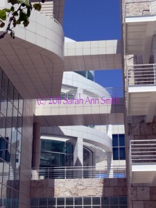
One of the architetural photos I took and used for the small pieces
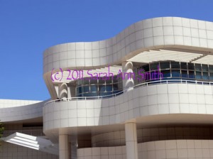
The other of the architetural photos I took and used for the small pieces

These two photos were the ones whose lines shadows most inspired me.  I love the interplay between straight lines and the curved, the grid of stone and the undulating shapes, the blue sky and the white stone, and the shadows.  I love how the architect used bands/lines of (metal?) whatever to create de facto louvers to shield the galleries and interior spaces from the bright sunlight, and how those bands create striped shadows on the pillars and walls.
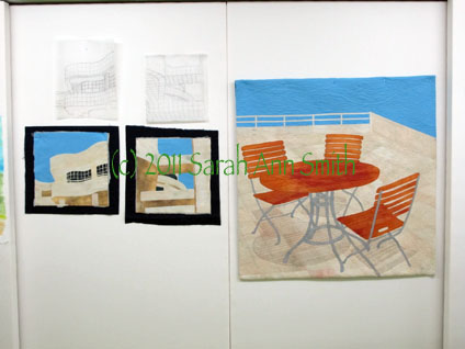
Here are the two smaller pieces, with batting and backing sticking out, and their sketches/tracings above.

Due to lack of time, I quilted both small pieces at once… I’d thread up on say ivory, quilt those areas, switch to cream and repeat, then to tan, etc. on both quilts, working my way to the dark of the windows and the sky and, finally the facings!

But I still wasn’t happy with the shadows from the table and chairs, so I went back to the now not-quite-done central piece.  In the next photo you can see the two pencils plus the paintbrush.
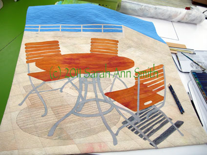
I still wasn't happy with the shadows (or lack thereof) on the main piece, which was ostensibly finished. Guess not. So I took out my Inktense by Derwent pencils (the Payne's Gray and a neutral gray) and took a deep breath
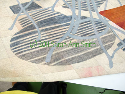
This picture shows the table shadows partially done....
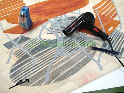
Using the pencils was a bit of a "thriller" moment: I used two colors of gray to get the shade I wanted. The lighter gray on the bottom is where I have colored over the gray quilting threads with the pencil (see black arrow marks on the photo). You can then dampen the pencil marks to create an ink and intensify the color. However, I didn't want the color to bleed into the sunny stripes that came through the slats of the table. So I took out the hair dryer! I used a damp paintbrush in my right hand to moisten the ink, and the hair dryer in my left hand to dry as I painted/wet the pencil-ink. I had very little bleeding into the sunny stripe as a result, and what I did have doesn't really impact the image much at all. PHEW...time for a nice glass of wine after that... I could have totally ruined the whole, finished thing...with just days to go before hanging the show!

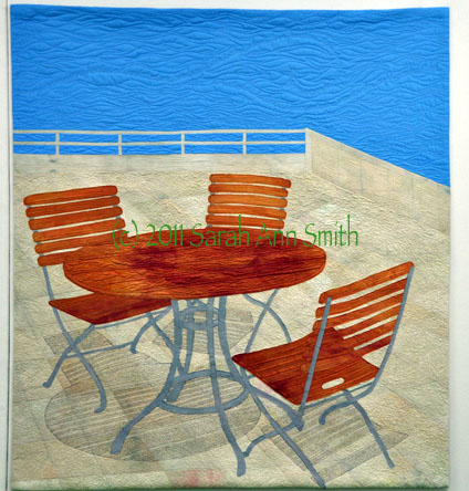
The quilt was getting better and I was disliking it less.  But it still wasn’t quite right to me.  There was too much blue at the top.  So for the show I “cropped” it by folding the top to the back… I’ll decide how much to trim off the top and re-do the facing and hanging sleeve after the show comes down.  So here is a question for those of you who have slogged through these blogposts:  how much should I remove from the top?  Here are three VERY similar versions:
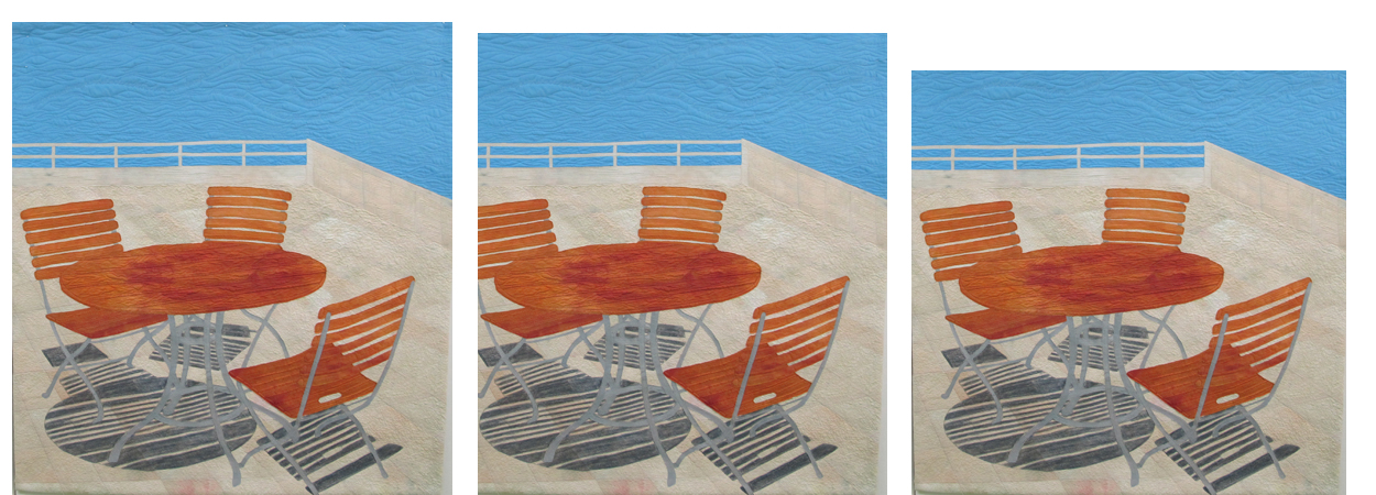
So I do I leave it alone (far left), crop a little (center) or crop a bit more (right)? Photo is clickable to see it larger...

So do I leave it alone with lots of blue, crop a tiny bit, or crop a little bit more?  The photo on the far left is as made.  The way it is hanging is about where I photoshopped it in the center photo, and the one on the right is close to square (think symmetry with the proportions of the two small pieces).  So do I crop?  How much?

And just to remind you…here are the three pieces done and in the show:
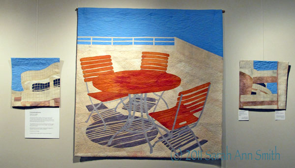
Conversations by Sarah Ann Smith -- click to see larger

And yes….I might maybe do another quilt or two… I mean, look at this water-maze-garden-hedge…  how cool is that?  and the cropped version below?
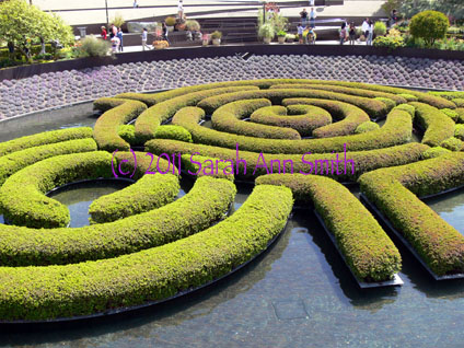
the green is hedge, the dark in between is water!, and beyond are plants on the "bowl" shaped slope in the gardens that surround this water feature.
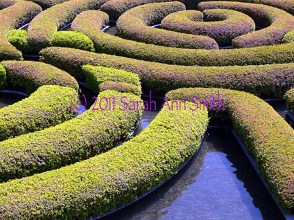
I just LOVE this rhythm and repetition....

Conversations, Part 2–starting the quilting

Tuesday, August 9th, 2011
The last time I wrote, I shared the ideas and dyeing the cloth and assembling the top to Conversations.  In this post, I’ll share the quilting, or at least the first part of i
I guess you’ll have to believe me when I say that in the narrow channels on the table, where the wood goes down vertically, there is writing to create the “shadow”

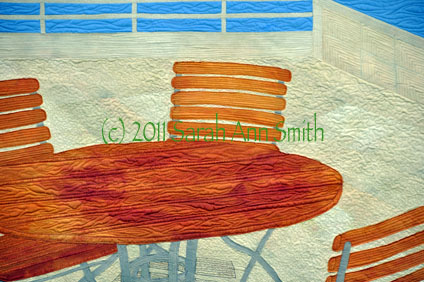
The path to finished wasn’t exactly smooth.  I dyed the fabric…several times.  I was having a bit of a brain scramble, and not once but twice mixed up the proportions of red-yellow-blue.  At least I have some lovely browns, and fortunately I managed to make just enough of the creamy stone to make all three pieces!  The sky fabric is the first time I’ve tried a vat dye (versus low immersion) where you stir the fabric to get a smooth, even color.  But since the Los Angeles skies are screaming blue, I was so happy when this turned out just right, and on the first attempt (thanks to taking a few dyeing fabric workshops with Carol Soderlund).

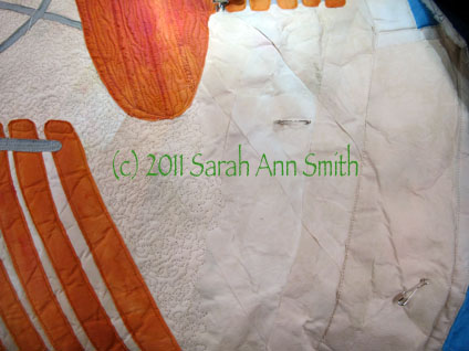
For this piece, I decided to try something different…instead of fusing the entire top, shifting my piece of non-stick press sheet as I work (I LOVE my Goddess Sheets from MistyFuse!), I thought I’d fuse everything to water-soluble stabilizer, often used in embroidery or thread  sketching.  What I didn’t think through is that because the top is FUSED, the stabilizer wouldn’t disintegrate when wet.  In fact, it ended up looking like a crumpled paper bag.  Erg.

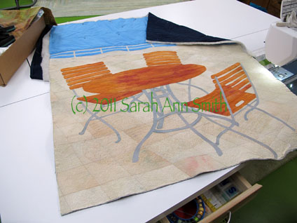
I used a small stipple on the paving stones to simulate the porous texture of the stone (usually I stay far away from a “regular” stipple!). As you can see from the unquilted part, the fused-to-stabilizer area looks hideous!
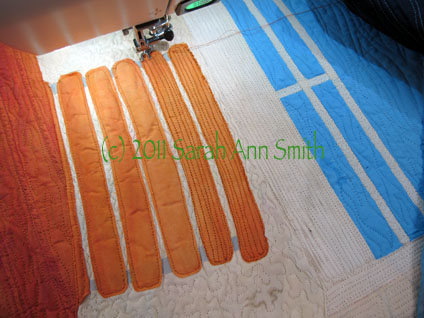
The slats on the chairs also just looked rumpled. I had wanted to leave them unquilted in the center so they would have more pop or loft to them, but they just looked icky. So when in doubt, quilt it to death! Here’s the in progress picture…


Some quilting done, but not all…yet.  Size will be 36 wide by about 40 tall….
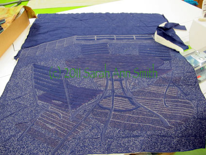
And at the same stage, but the back. As you can tell, I haven’t begun work on the sky or the chairs/slats.  Why do I so often prefer the backs of my quilts?


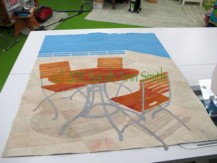
Shadows quilted, sky quilted, squared up.  I don’t really like it.  (Don’t worry…I made it better…at least I think it is better….)
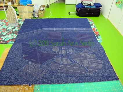
The back, with the quilting done.
Facings and hanging sleeve are on, and up on the design wall. Still not happy…the shadows aren’t bold enough. It was those striking lines and contrast that grabbed me, and that impact isn’t there.

In the next post on this series, I’ll share what I did to fix the quilt (well, I hope I fixed it and didn’t make it worse!) and the two smaller pieces.  More coming soon!